


Posted inVector Art
How to Craft Unique Vector Art for Brand Identity in 2026
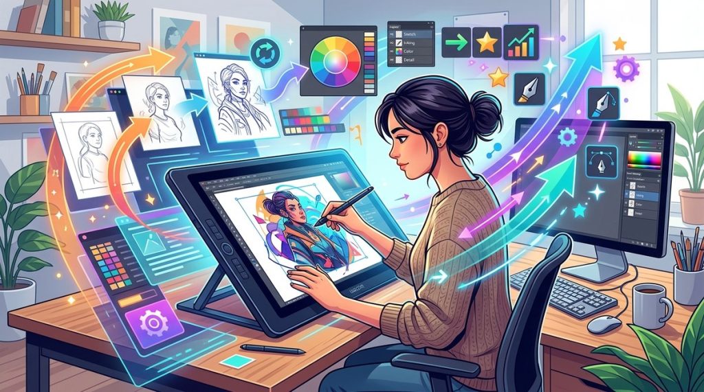
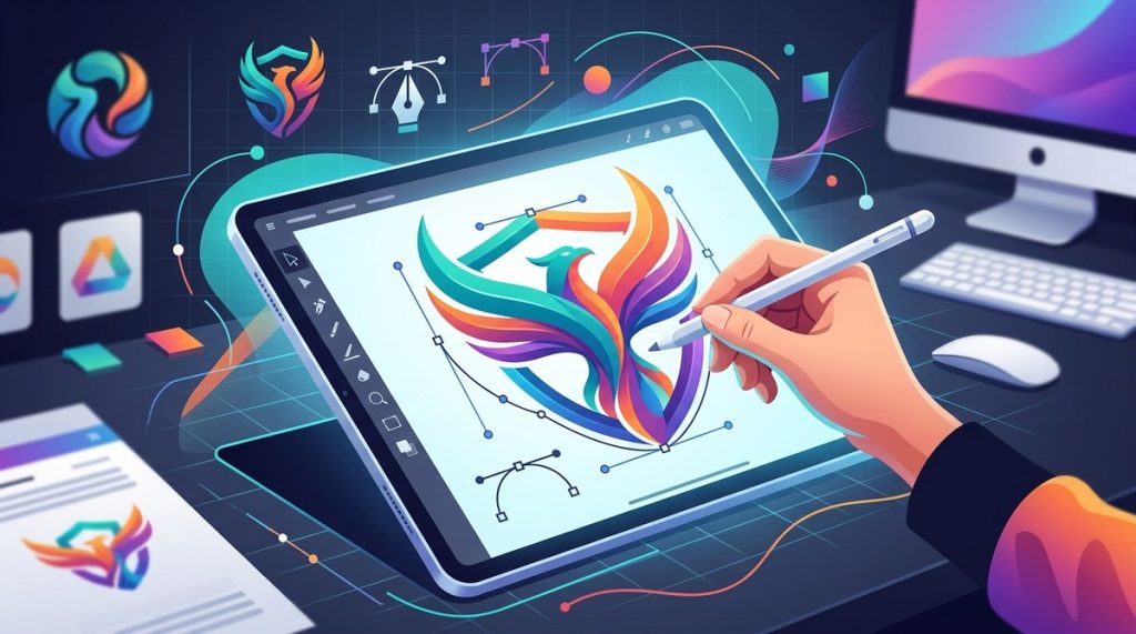
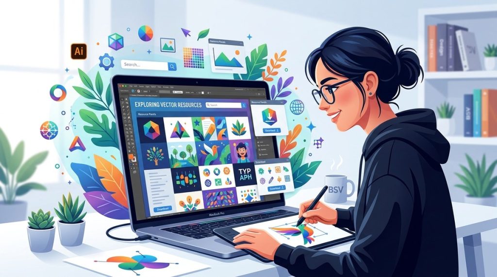
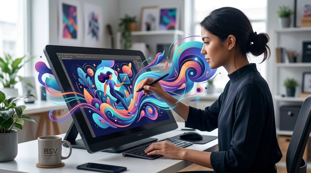
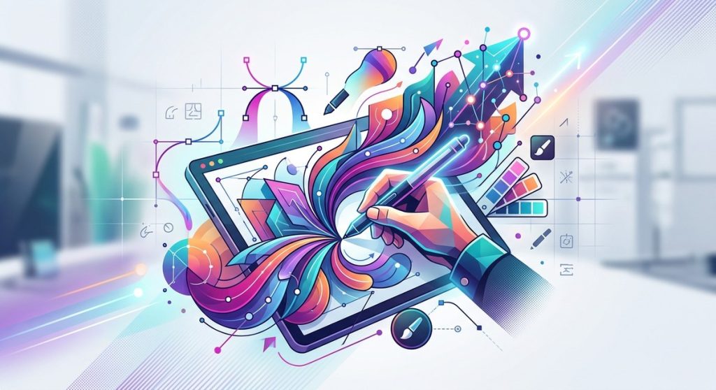
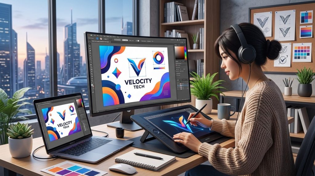
Creating a memorable brand identity in 2026 means standing out in a crowded digital landscape. Vector art remains at the core of modern branding, thanks to its scalability, flexibility, and crisp appe...